Reports
 Updated
by
Aleksandar Grbic
Updated
by
Aleksandar Grbic
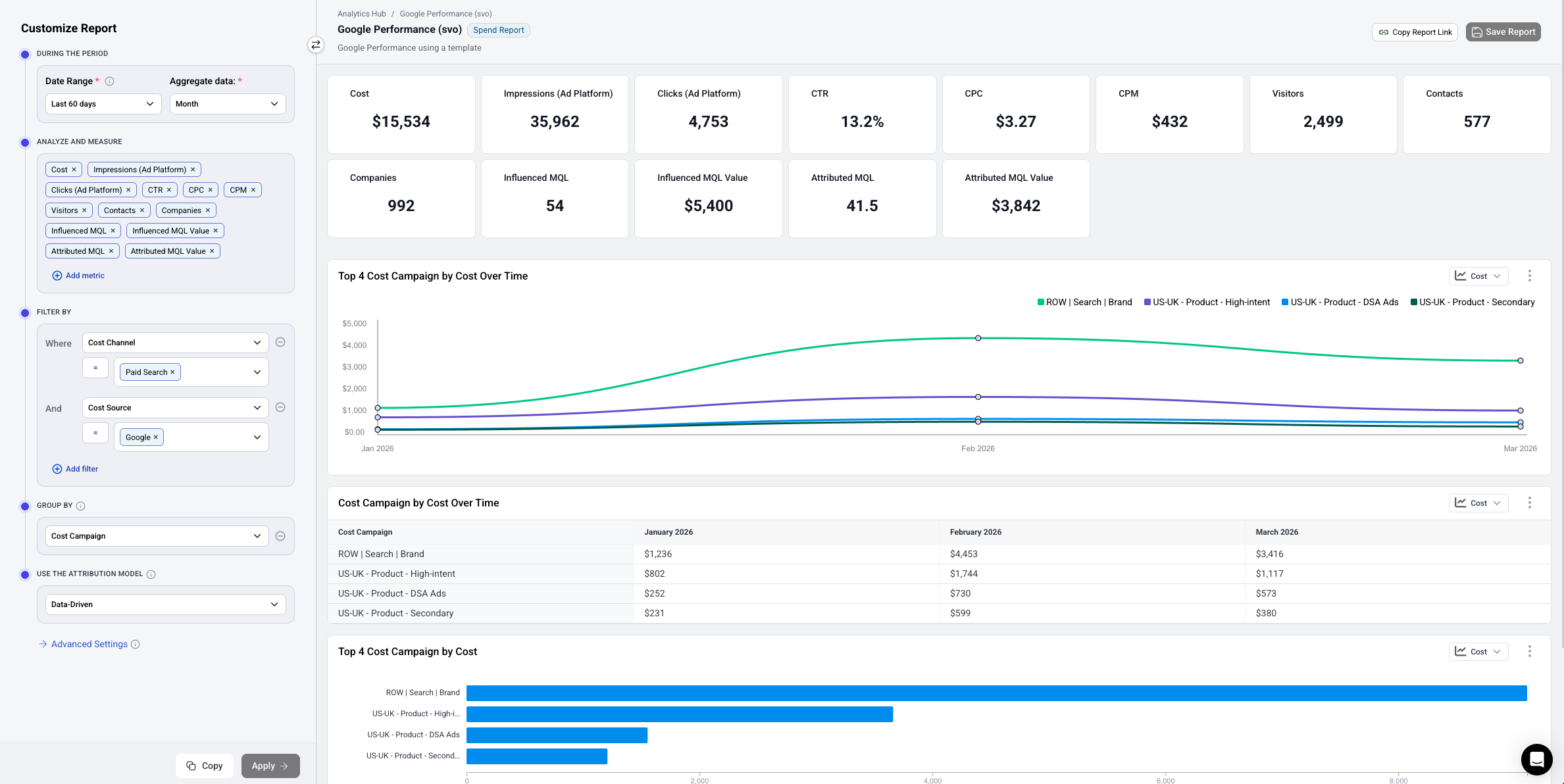
A report is the starting point for analyzing marketing data in Dreamdata Analytics Hub. You build a report by choosing the type of report, what to measure, how to group it, and which time period to look at. Once configured, the report generates a set of widgets — metric cards, graphs, and tables — that summarize and visualize your data.
Creating a Report
- Navigate to the Analytics Hub home.
- Choose how to start:
- Select a template from the Template Gallery to start with a pre-built configuration that fits your use case. This is the recommended path.
- Click Create from Scratch and choose a report type to start with an empty configuration. This should be considered an advanced option.
- Use the configurator ("Customize Report" panel) on the left to configure your report.
- Click Apply to generate or update the report's widgets.
- Click Save Report in the top-right corner to save your work.
Configuring a Report
The configurator ("Customize Report" panel) on the left side of the screen contains all the building blocks for your report. The section below covers configuration at a high level. See the configurator documentation for a more detailed breakdown. The configurator will contain slightly different elements depending on the report type you are looking at.
Date Range
Choose the time period your report covers.
- Click the Date Range dropdown under "During the Period."
- Select a preset range (e.g., "Last 90 days") or define a custom range.
- The date range is required (marked with a red asterisk).
- In stage reports the date range selects either the time when a company reached a specific stage.
- In spend, performance and engagement reports defines the spend or activity cohort you are looking at.
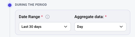
Aggregation Period
Choose how your data is grouped over time.
- Use the Aggregate data dropdown next to the date range.
- Options include Day, Week, Month, Quarter, etc.
- This controls how time-series widgets (graphs and tables) bucket your data. For example, selecting "Month" groups data into monthly intervals.
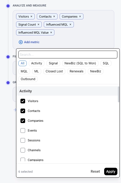
Metrics (Analyze and Measure)
Select the metrics you want to analyze.
- In the Analyze and Measure section, you'll see your currently selected metrics as tags (e.g., Visitors, Contacts, Companies).
- Click Add metric to add more metrics.
- Click the × on a metric tag to remove it.
- Each metric you select will appear as a metric card widget at the top of your report, and will be included in graphs and tables.
Examples of common metrics: Visitors, Contacts, Companies, Influenced MQL, Influenced MQL Value, Attributed MQL, Attributed MQL Value.
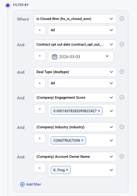
Filters
Narrow your report data to specific subsets.
- In the Filter By section, click Add filter.
- Choose the dimension and value(s) to filter on.
- Filters are optional — if none are set, the report includes all data.
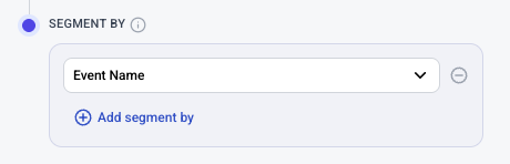
Segment By
Segment your data by a specific dimension.
- In the group by section, select a dimension from the dropdown (e.g., "Cost Source").
- When a segment by is applied, graphs and tables will break down data by that dimension (e.g., showing separate lines for LinkedIn vs. Google).
- Click the clear button (×) to remove the segment by.
- It is possible to segment your report by two metrics. To add a secondary segmentation, click + Add segment by
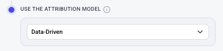
Attribution Model
Choose which attribution model to use for calculating attributed metrics.
- In the Use the Attribution Model section, select a model from the dropdown (e.g., "Data-Driven").
- This affects how credit for conversions is distributed across touchpoints.
Advanced Settings
Click Advanced Settings at the bottom of the configuration panel to access additional options.
Understanding Your Report
Once you click Apply, the report generates a set of widgets based on your configuration:
- Metric cards at the top show summary totals for each selected metric.
- Time series graphs show how your top segments perform over time.
- Data tables show period-by-period breakdowns.
- Bar charts show comparisons across segments.
- Summary tables show all metrics broken down by your group by dimension.
Each widget can be further customized — see the Widgets guide for details.
Saving and Managing Reports
- Click Save Report in the top-right corner to save.
- Give your report a descriptive name by clicking on the title ("Untitled Report") at the top.
- Add an optional description below the title.
- You can also tag your report with a type (e.g., "Spend Report") for easier organization.
- Saved reports appear in the Analytics Hub home.
Tips
- Start with a template if you're unsure which metrics to choose — templates provide pre-configured reports for common use cases.
- Change the group by dimension to explore your data from different angles without reconfiguring the entire report.