Widgets
 Updated
by
Aleksandar Grbic
Updated
by
Aleksandar Grbic
A widget is a visual component that displays data within a report or dashboard. When you apply a configuration to a report, Dreamdata automatically generates a set of widgets based on your selected metrics and group by dimension. You can also add individual widgets to dashboards.
Widget Types
Metric Cards
Metric cards display a single summary number for a given metric across the entire report period.

- One card is generated for each metric you've selected in your report.
- Each card shows the metric name and its total value (e.g., "Visitors — 18,155").
- Metric cards give you a quick at-a-glance summary of your report.
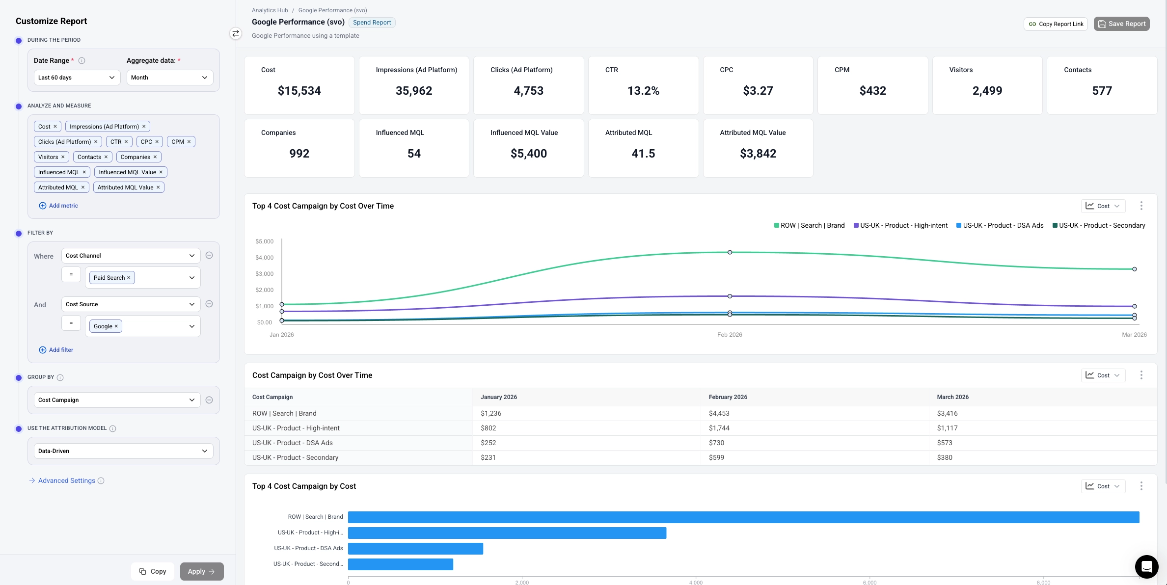
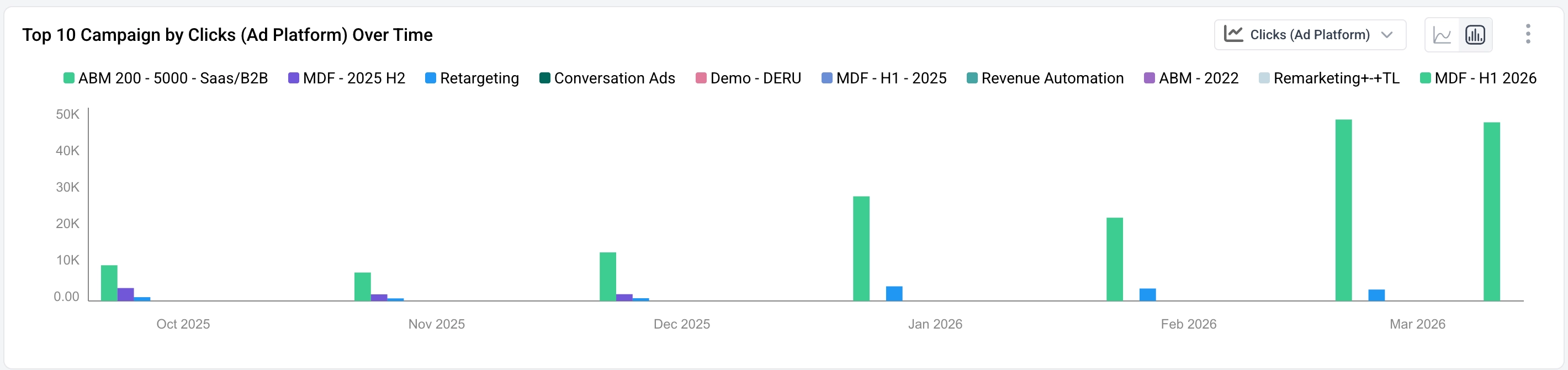
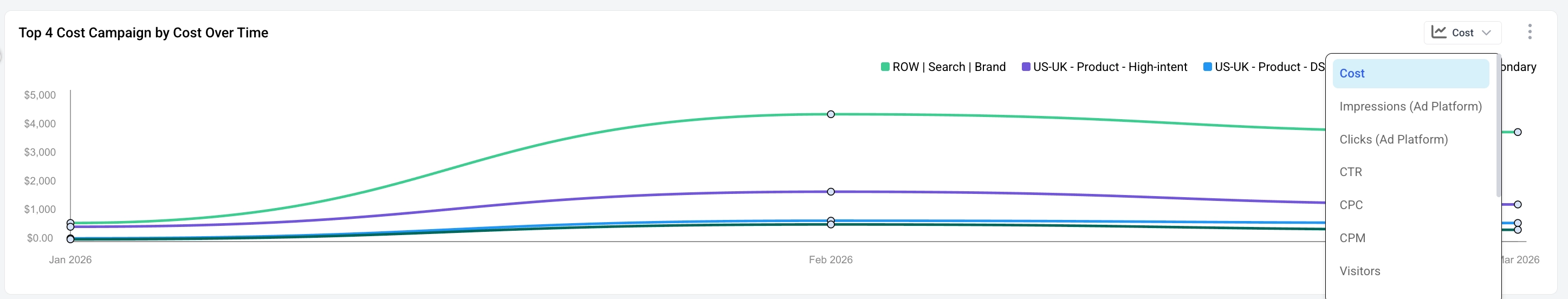
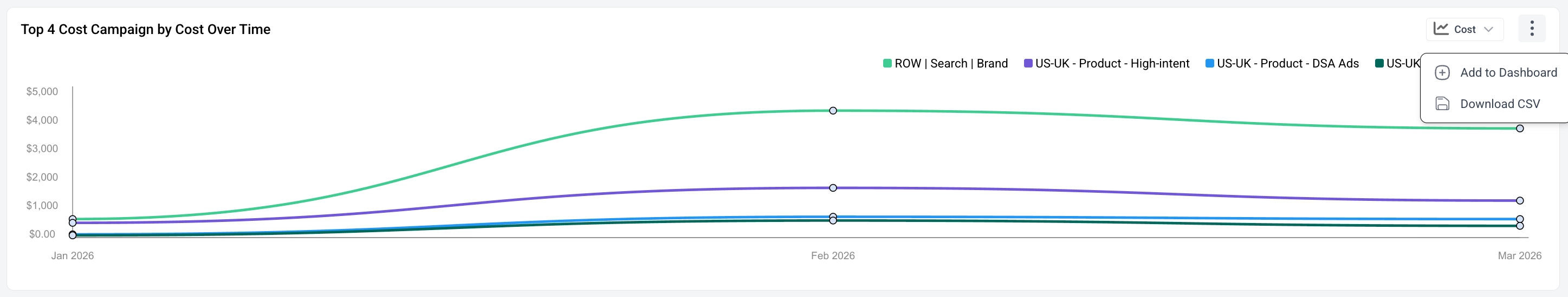
Time Series Graphs
Time series graphs show how your data trends over time.
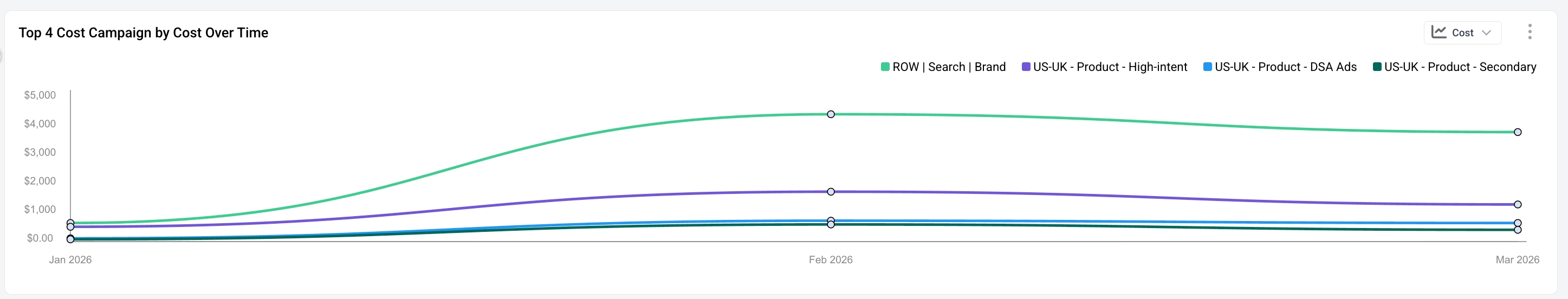
- The x-axis represents time, broken into intervals based on your aggregation period (e.g., monthly).
- Each line represents a segment from your group by dimension (e.g., LinkedIn, Google).
- A legend in the top-right identifies each line.
- The graph automatically highlights the top segments by the selected metric.
- You can select the metric to display by clicking the dropdown in the upper right hand corner of the graph.
Line vs. Bar View
Time series graphs can be displayed as a line chart or a bar chart. Two icons to the left of the metric dropdown toggle between the views:
- Line chart (default) — Each group by segment is drawn as a continuous line across time. Best for tracking trends and trajectories.
- Bar chart — Each time interval shows one bar per segment, grouped side-by-side. Bar height corresponds to the metric value. Best for directly comparing segment performance within each period.
The legend, metric dropdown, and three-dot menu behave identically in both views.
You can download a CSV of the data in the graph or add the graph to a dashboard by clicking three-dot menu (⋮) in the upper right hand corner of the table.
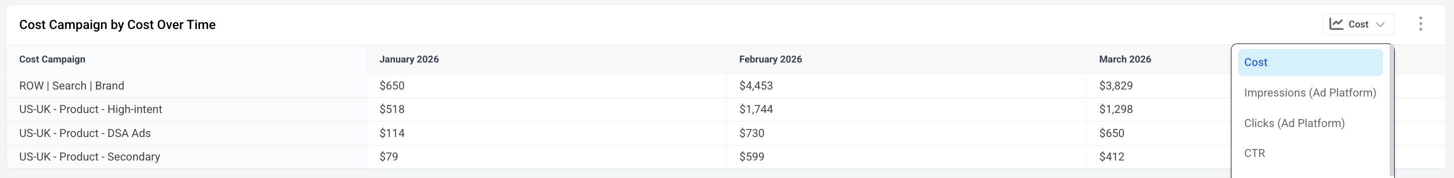
Data Tables
Data tables display detailed, period-by-period breakdowns of your data.
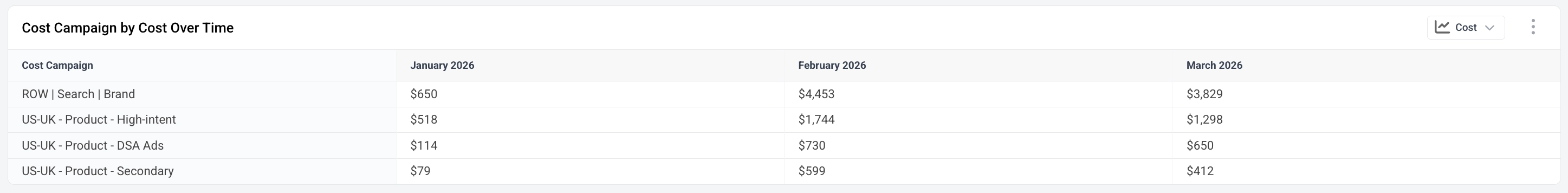
- Rows represent segments from your group by dimension.
- Columns represent time periods based on your aggregation period.
- Cells show the metric value for each segment in each period.
- You can select the metric to display by clicking the dropdown in the upper right hand corner of the table.
You can download a CSV of the data in the table or add the table to a dashboard by clicking three-dot menu (⋮) in the upper right hand corner of the table.
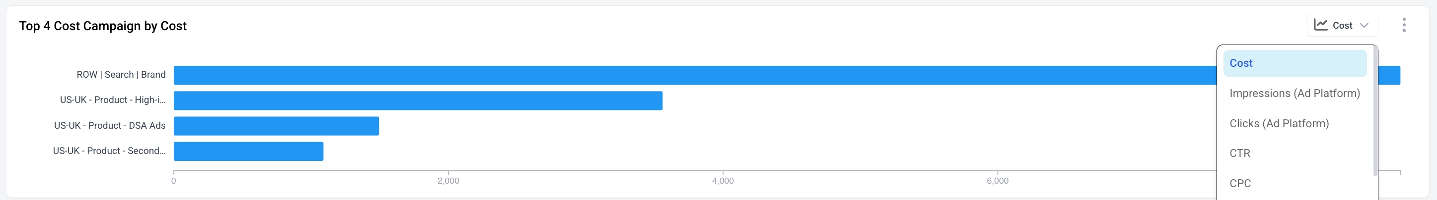
Horizontal Bar Charts
Bar charts provide a visual comparison across segments.
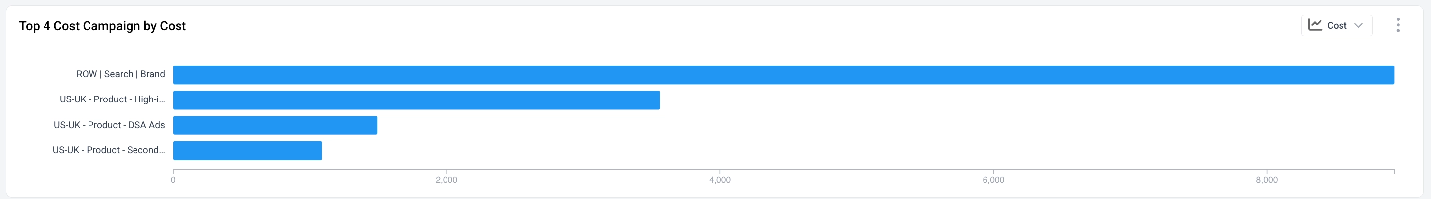
- Each bar represents a segment from your group by dimension.
- Bar length corresponds to the metric value.
- Useful for quickly seeing which segments are performing best.
- You can select the metric to display by clicking the dropdown in the upper right hand corner of the chart.
Summary Tables
Summary tables show all selected metrics broken down by your group by dimension in a single table.
- Rows represent segments (e.g., LinkedIn, Google).
- Columns represent each selected metric (e.g., Visitors, Contacts, Companies, Influenced MQL, etc.).
- This provides a comprehensive cross-metric comparison in one view.
Customizing Widgets
Switching the Displayed Metric
Many widgets have a metric selector dropdown in their top-right corner (shown as a button with the metric name, e.g., "Visitors").
- Click the dropdown to switch which metric the widget displays.
- This lets you explore different metrics without changing the overall report configuration.
Widget Actions Menu
Click the three-dot menu (⋮) in the top-right corner of a widget to access additional actions:
- Add the widget to a dashboard
- Other widget-specific actions, such as downloading a CSV of the data or adding the chart or table to dashboard.
Adding Widgets to Dashboards
You can take any widget from a report and add it to a dashboard:
- Click the three-dot menu (⋮) on the widget you want to add.
- Select Add to Dashboard.
- Choose an existing dashboard or create a new one.
This lets you curate a dashboard that combines the most important widgets from multiple reports. See the Dashboards guide for more details.