Revenue Attribution
In this dashboard we show the process of connecting B2B go-to market efforts with revenue and pipeline generated. This report allows you to assess and evaluate data which connects businesses to potential customers.
Filters
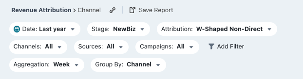
Date: Set the time period you want to investigate
Stage: You can select your preferred pipeline stage. Read more about the Free Tier Stages here
Country: Choose the country you want to analyse
Industry: Choose the industry you want to investigate
Employees: Segregate companies by the number of employees
Annual Revenue: Segregate companies by their annual revenue
Account Owner: Choose the account owner’s accounts you’d like to view
Aggregation: Set the time frame you wish your data to be displayed as
Grouped by: Choose certain options to see how it affects your deals
- Channel
- Source
- Channel + Source
- Campaigns
- Source + Campaign
- Landing Pages
- Referrer Url
- Referrer Host
Metrics
Deals: The number of deals who we have been able to identify as your chosen stage
Value: The amount of revenue that is based on your chosen stage. It can represent basic value estimation of sign up, expected revenue of deal created or actual revenue of deal won, taken from your CRM
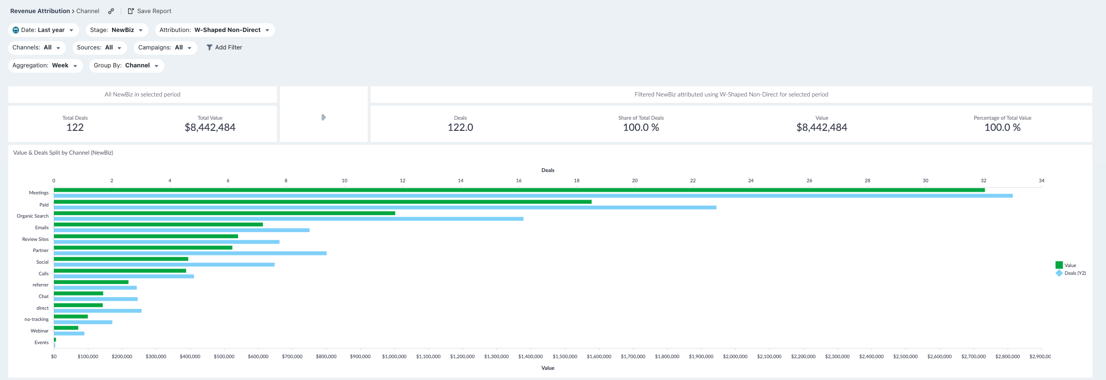
Funnel Overview

This row shows the last section of your funnel. We provide the total number of Attributable Deals and Attributable Value (revenue) that can be assigned, based on the filters selected.
To calculate these numbers, we first look at the pool of contacts/companies that visited your website based on the dates/filters. Once we have that group, we see what deals were closed after their visit, up to today's date. More importantly, we are only looking at deals where we have a recorded history of sessions, Attributable Deals. This pool of attributable deals will make up the basis for this section. For each of these deals and all their sessions, we will run the Attribution Model you have selected so each session is weighted accordingly.
For both Attributable Deal and Value (revenue), we then provide the sum of these amounts for each session that contains conversion, dependent on which Attribution Model you have selected.
Note: When using First Touch/Last Touch you will get a rounded Deal number, as a deal is either First Touch Paid or Not. Whereas, with Linear, W-Shaped or U-Shaped you will get a fraction of a deal as most Paid touch points will make up a fraction of the sessions on a deal.
Graph and Tables
Value and Deals split by Sources
We provide a graph showing the attributable Deals and Value of each Source over the period of time specified in your Filters. This information can help you understand which Sources convert better. Remember to adjust the Stage Model on your preferred business outcome investigation.
Note: This Graph is used for a quick overview of Value and Deals generated via different Sources (split by your chosen Group By filter). Change the filter to display: content, devices, countries, etc.
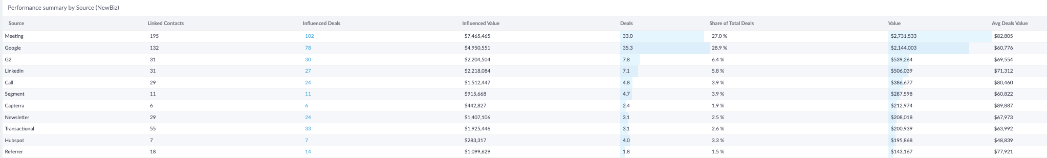
Performance summary by Source
In this table, we list all the Sources that were used during the time frame specified. We provide all the metrics for Sources making it easier for you to compare and find out which performed and which ones did not perform.
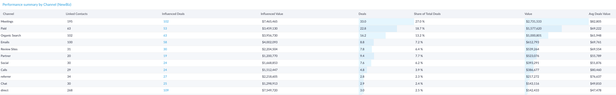
Performance summary by Channel
This report shows which channels have been used by your contacts, and which channels bring more value than others.
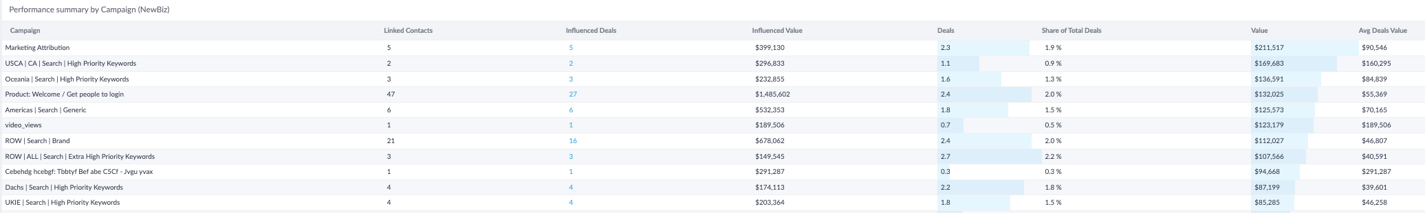
Performance summary by Campaign
This report shows which campaigns influenced your contacts, and which campaigns bring more value than others.
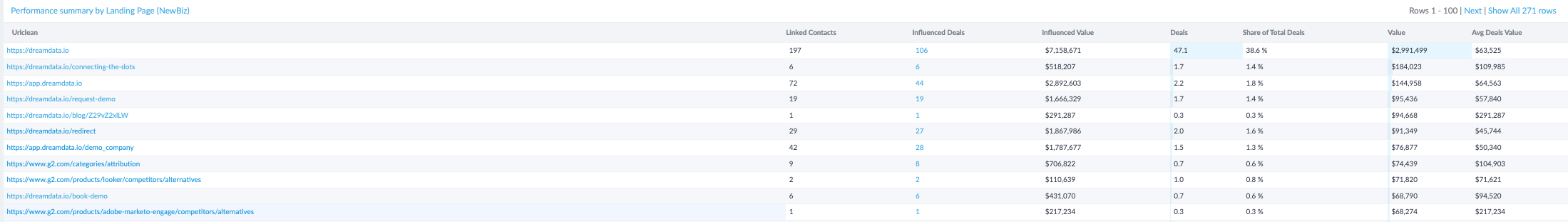
Performance summary by Landing Pages
This report shows which landing pages have been used by your visitors, and which landing pages bring more value than others.
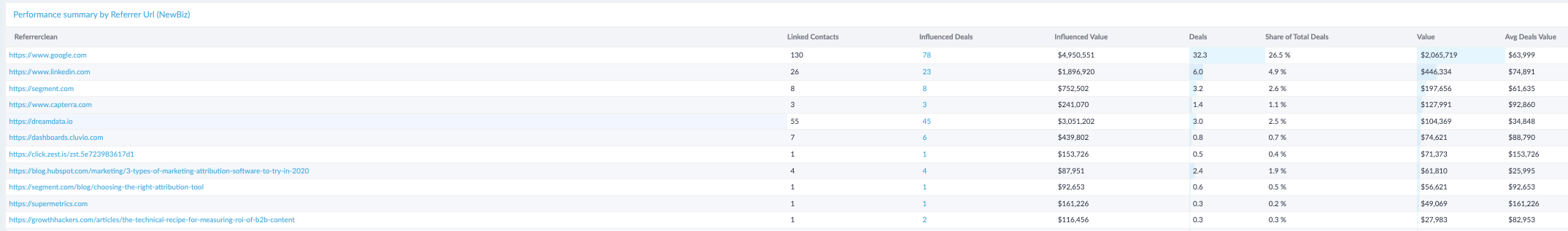
Performance summary by Referrer Url
This report shows which referrer URLs have been used by your visitors, and which referrer URLs bring more value than others.
Performance summary by Referrer Host
This report shows which referrer hosts have been used by your visitors, and which referrer hosts bring more value than others.
Note: You can open a larger view by clicking on the performance title in the top left corner.
Columns in the table (Contacts, Influenced Deals/Opps/Leads, Influenced Value, Deals/Opps/Leads, Value)
Depending on the stage model there will be a column called "Influenced Deals/Opps/Leads". This is the number of deals/opps/leads that were influenced by the channel (or any other dimension you selected to split the table on). "Influenced Value" is the total value influenced. The same deal/opp/lead can be counted fully multiple times. E.g. there were 10 deals/opps/leads in the selected period. 6 were influenced by paid, 7 by organic, 10 by sales. If you add up all the numbers in these columns they will sum to more than actual number of deals/opps/leads and value.
The other key set of columns is called "Deals/Opps/Leads" and "Value". In these columns you will find attributed values. Depending on the selected attribution model the value and deals/opps/leads will be distributed across the selected dimension. Here a deal/opp/lead is broken into fractions and split according to the attribution model. If you add up all the fractions of a deal it will always add up to 1 and the full amount on the deal. E.g. there were 10 deals/opps/leads in the selected period. 6.5 were attributed to paid, 2.25 to organic, and 1.25 to sales. If you add up all the numbers in these columns they will sum to the actual number of deals/opps/leads and value.
Finally there is a "Contacts" column. This gives you the number of identified contacts on the influenced deals, where the contact had minimum one touch from the channel (or any other dimension you selected to split the table on).
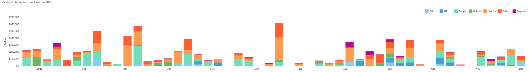
Value split by Source over Time
With this graph we display which Sources brought the most Value over the chosen time period. Use the Aggregate filter to breakdown the X-Axis as you wish.
Note: This Graph is used for a quick overview of Value generated via different Sources (split by your chosen Group By filter). Change filter to display: channel, source, campaign, etc.
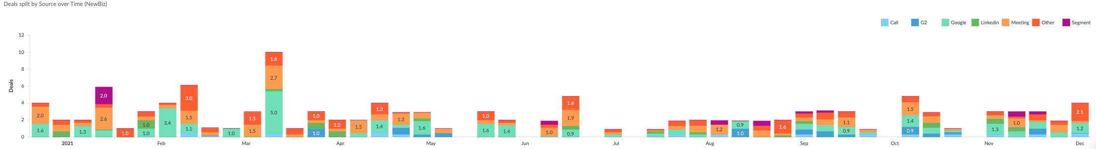
With this graph we display which Sources brought the most Deals over the chosen time period. Use the Aggregate filter to breakdown the X-Axis as you wish.
Note: This Graph is used for a quick overview of Deals generated via different Sources (split by your chosen Group By filter). Change filter to display: channel, source, campaign, etc.