What content generates pipeline?
 Updated
by
Mikkel Settnes
Updated
by
Mikkel Settnes
How to use Dreamdata to measure which content is affecting your pipeline
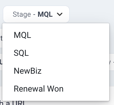
In Dreamdata, pipeline stages are defined using the 'Stage' option.
First step is to choose which stage to analyse. Below we use Marketing Qualified Lead (MQL) as an example.
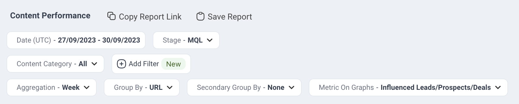
To analyze which content views (in a selected time period) are influencing MQLs, we set the dashboard options as shown.
This will setup the report to investigate:
- Which content influences the most MQLs?
- How many MQLs were affected by content views happening in the selected time period?
For each content view we track if that view becomes part of a journey leading to a MQL, SQL, NewBiz etc.
When new MQLs are created, the numbers for the content (that are part of those journeys) are therefore updated. It is worth noting that we usually see a lag between views and, for example, MQL creation.
The Group By option indicates the granularity of the content we want. The default is URL, but if you are tracking a substantial amount of individual URLs, it might provide you with a clearer view when grouped by Content Category. Note that content categories need to be setup within the Dreamdata application (see here).
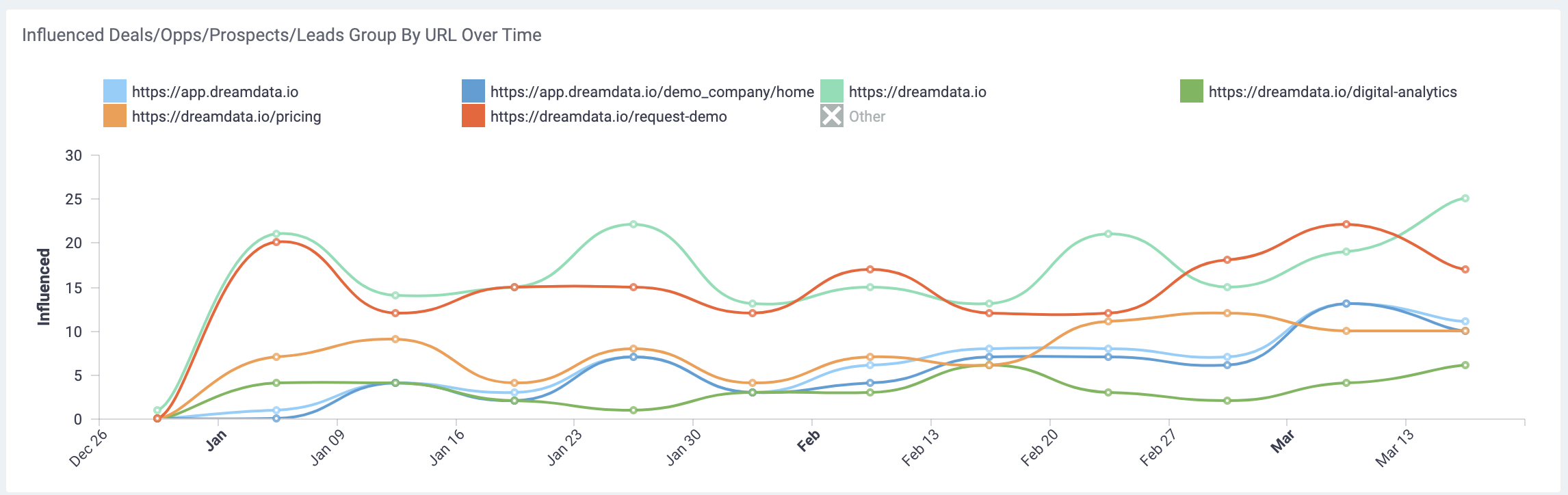
The first graph shows how the number of Influenced Leads evolves over time (to change the metric of this graph use the Metric On Graph option at the top of the page).
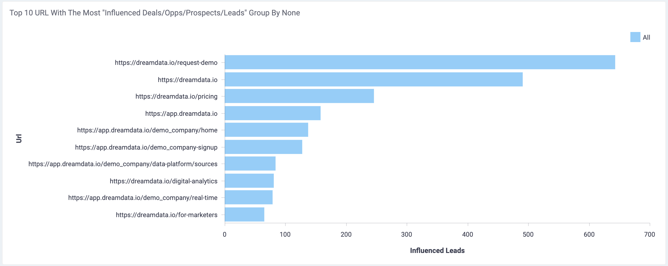
The second graph of the report shows the top 10 urls based on how many Leads (=MQLs) they influenced.
In other words, how many MQL journeys contain a view of the specific content? - meaning that one of the stakeholders in that journey has consumed the specific content.
This generates a quick overview of the content (= URLs or categories) that influenced the most of the selected pipeline stage.
The summary table shows the detailed performance of each url or category. Note that no secondary group by is selected in this analysis, so it is showing 'All' (= no split groups).
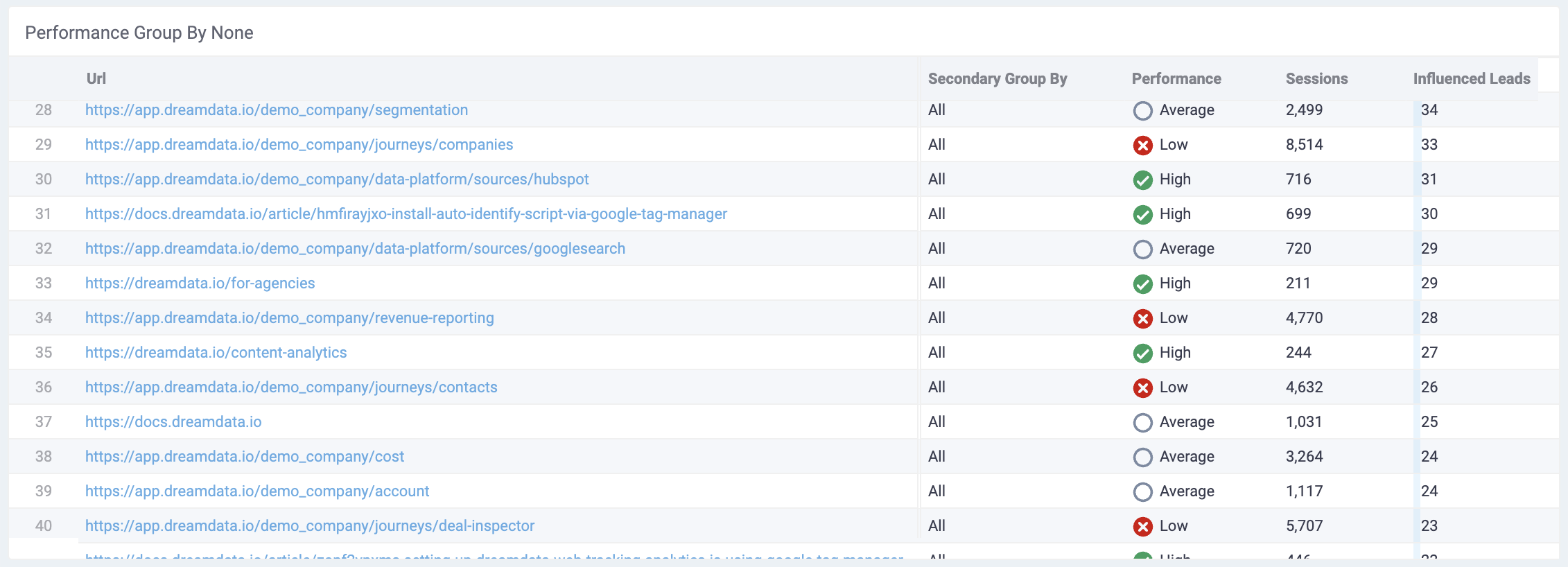
The Performance indicator (High, Low, Average, Insufficient Data) is based on the Influenced Leads per Session in the following way, and is meant to ease the identification of content pieces to scale
- High Performance: content in top 25% of Influenced Leads per Session with sufficient data.
- Low Performance: bottom 25% of the Influenced Leads per Session with sufficient data
- Insufficient Data: content with fewer than 200 sessions. Here there is not enough data and we should therefore treat the value of Influenced Leads per Session with more uncertainty.
In this table, we can identify the content that is performing well i.e. have a high number of Influenced Leads and compare content with different traffic using the Influenced Leads per Session metric.
A high Influenced Leads per Session % indicates that many of the sessions are connected to actual Leads. Meaning that readers of this content piece have a high likelihood to become Leads at a later point in time. We therefore aim to scale the content that show a high number of Influenced Leads and where the sessions effectively influence Leads (= Influenced Leads per Session)
See here for a detailed description of the importance of measuring the influence over a long period of time.
A high Influenced Leads per Session % that is partially caused by a low number of sessions, indicates that the content is currently primarily read by Leads. Therefore, it is a good candidate to drive more traffic to, in order to see if the Influenced Leads per Session % keeps being high when increasing traffic.
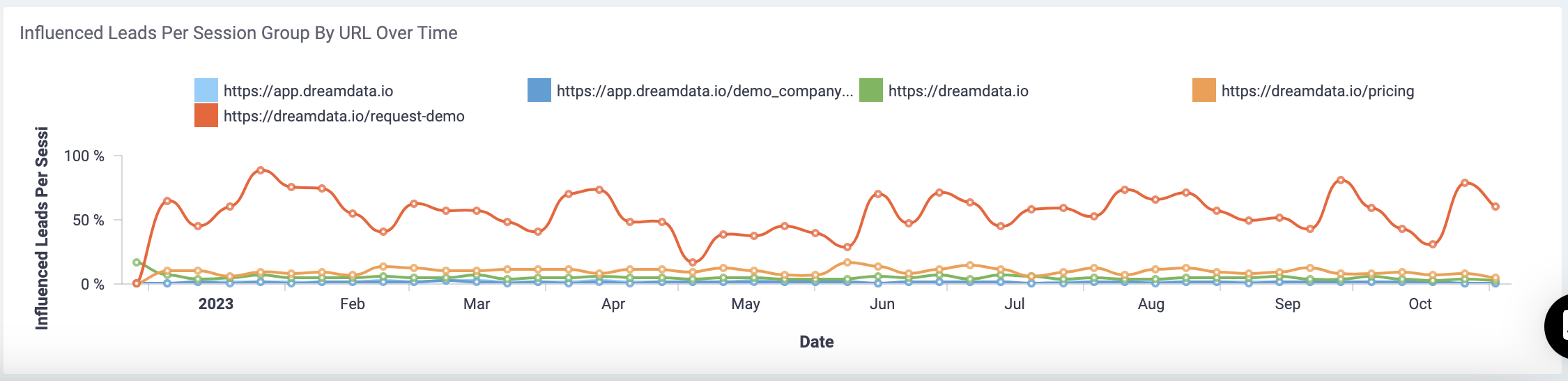
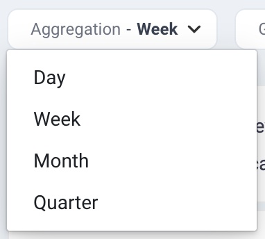
The last graph can be used to follow the progress of specific urls or categories over time. The time aggregation is controlled by the option Aggregation at the top of the page.
We follow the Influenced Leads per Session % to analyze if the content performance increases or decreases over time i.e. are the % of sessions that influenced leads increasing or decreasing with time.